JOIN THE
NEWSLETTER
GET NEW POSTS SENT STRAIGHT TO YOUR INBOX
YOU JUST RELAX AND SIT THERE!
+
GET A BUTT LOAD OF TEXTURES I USE IN
MY OWN WORK FOR FREE WHEN YOU SUBSCRIBE.
It's free. No spam. Unsubscribe anytime you like.
You will also instantly receive a free collection of textures that I use in my work!
Greetings friends! Here is a straight-up documentation of my most recent commission. I was contacted by my agency with an offer to produce a series of illustrations for City Art, Sydney. “City Art is the City of Sydney’s program for public art, supporting local and international artists to contribute to the creative and cultural heartbeat of our city.”
Based on the compilation below, my agent said that the client had selected my style of work for a concept phase with the following brief:
“The successful artist will be invited to produce ten illustrations to realistically portray a selection of public artworks in the City Art collection. The artist is to produce illustrations of works in their entirety, which can be easily recognised by the public.”

The client was looking to create ten illustrations, in postcard form, of artworks and sculptures located in the city of Sydney.
Before they were happy for me to proceed, I was required to complete a “concept phase”. This was a matter of emailing them a proposal of how I would visually represent each illustration (style, colour, composition etc.) along with a rough mock-up of one of the artworks as an example.
—
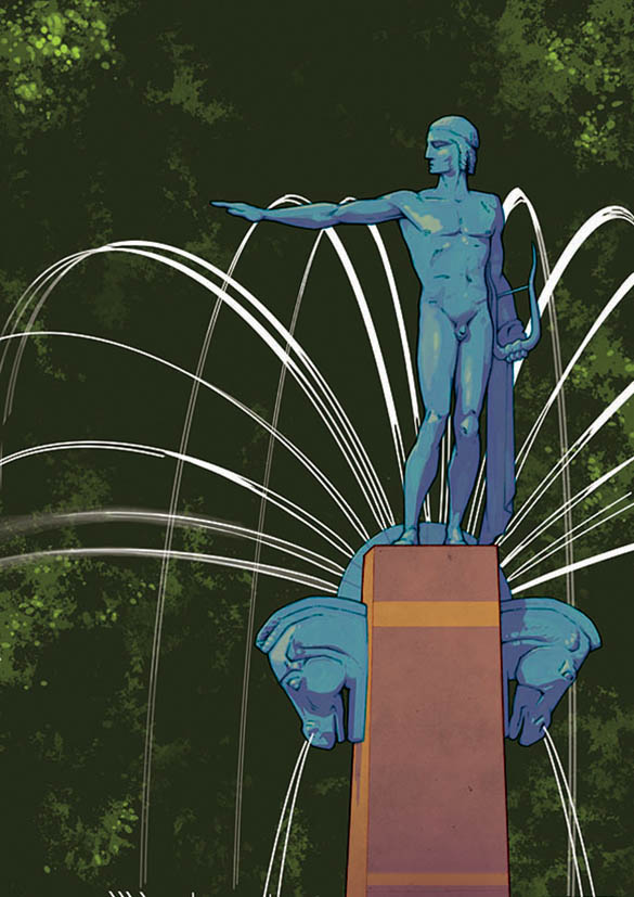
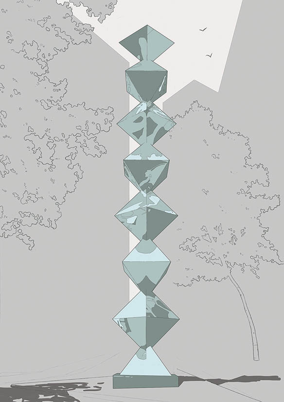
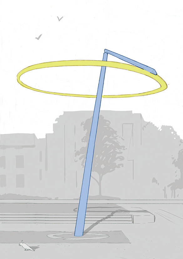
I sent the below image as a mock-up with the following proposal:

“THEME
Regarding a theme running through the postcards, I thought it would be great to depict each artwork with strong natural lighting. It’s an element I like to include in a lot of my illustrations, where strong shadows are cast (see the “Toycar” & “Bedroom” images in the examples of my work you were sent.)
I think this will create a more impactful and complimentary portrayal of the pieces, by having a feeling of a “real” moment in time being caught. Sort of in the style of Edward Hopper’s compositions. He is a big influence on my artwork.
Strong lighting/shadows also highlight the form and the little intricacies of the artwork pieces. The unique shadow of “Halo” I thought was really lovely, and is probably an under-appreciated element to this piece for passers-by, who can only really view it from ground level.
COLOUR
Colour wise, I was thinking of having the background and surrounding elements in low saturated colour, and the artworks in more bold, saturated colour. I think this will bring more focus to each piece, and give them more impact. (See image A and the “Toycar” image for example)”
—
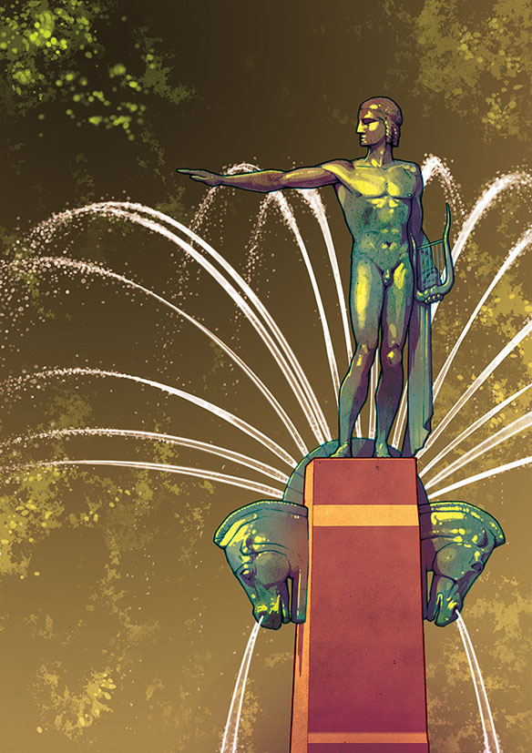
They were happy with my proposal, and decided it was necessary to carry out the illustrations in two sets of five. With the first 5 artworks confirmed, I went about creating two rough compositions for each of the first five to send them.
That was the initial plan anyway, but a few weeks into the project they decided they wanted to change it to just five images. It halved my fee for the job, but also halved my workload, so I was fine with it.
Below I run through the working process for the project. You’ll see for some of them I initially went a bit overboard with the colouring. I drifted away from the style proposal I first put to the client, of which they reminded me, and I later toned down the colours.
—
I was provided with a few source photos of each artwork and did my own research to find more.
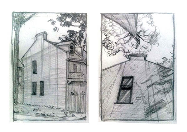
It was important to get a good idea of the scale of each piece, and how it sits in it’s surrounding environment. As lighting and shadow were to be a key feature of each illustration, I wanted to find images that also showed how the light hits each piece.
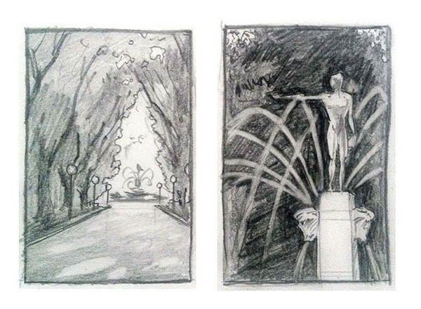
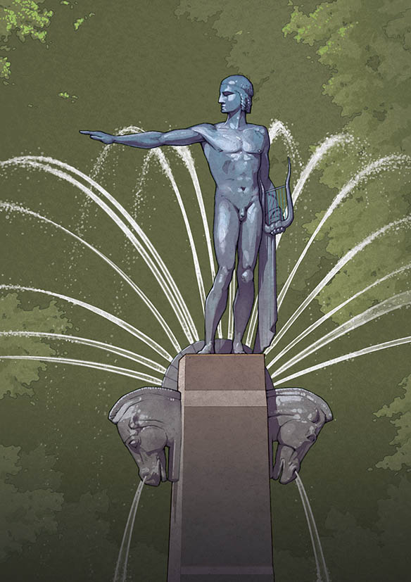
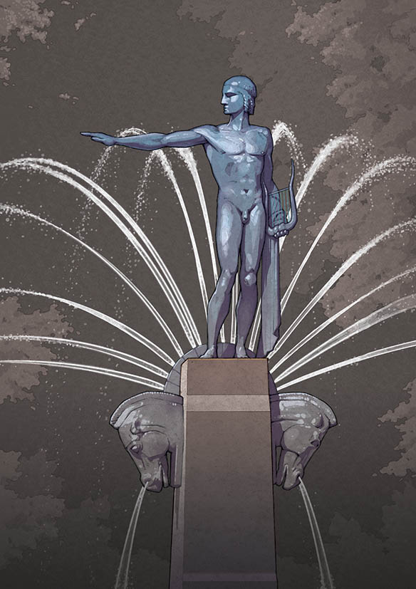
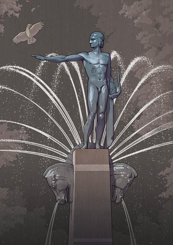
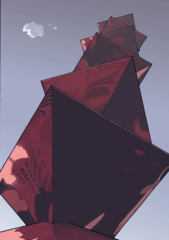
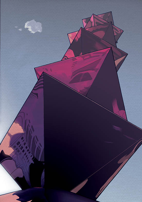
There were many options for depicting the large fountain, but I felt that simply cropping and directing focus to the top of the fountain worked best in my eyes.
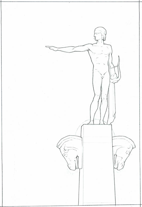
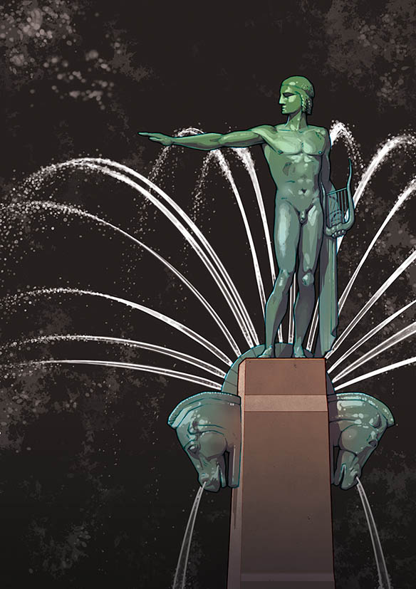
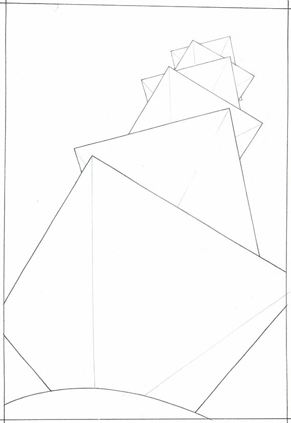
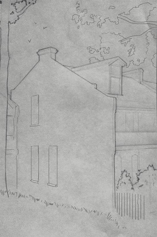
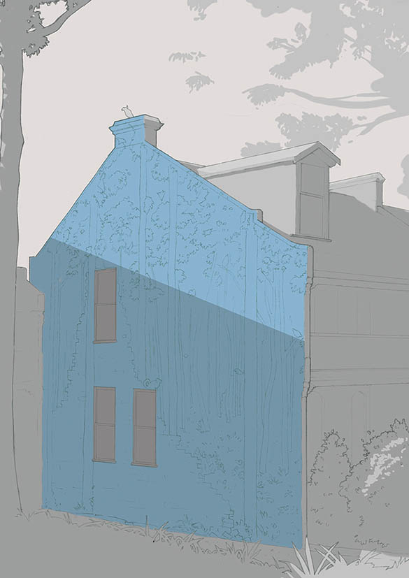
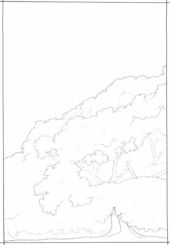
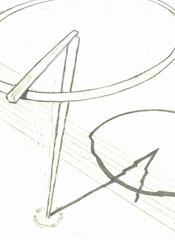
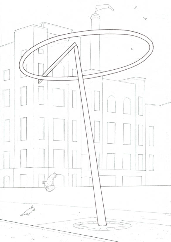
For every piece of artwork you work on it’s crucial to get the original drawing (line work) right, as this is the foundation, and you can’t build anything on a weak foundation.
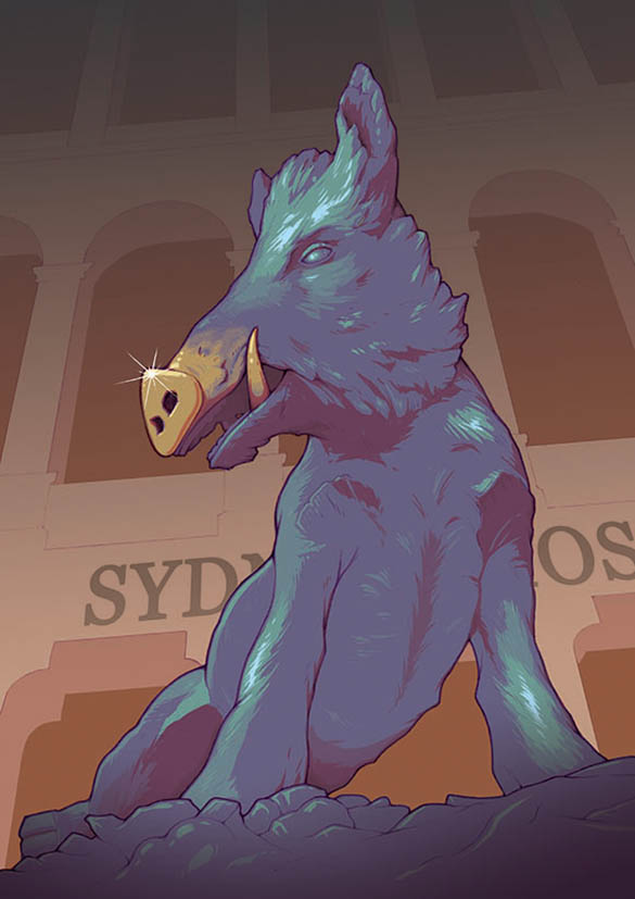
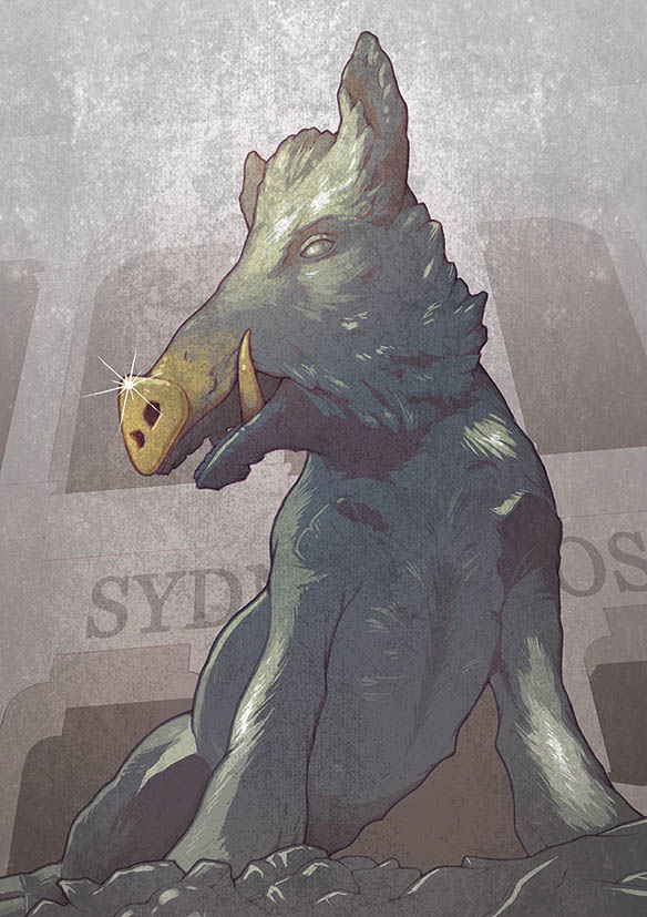
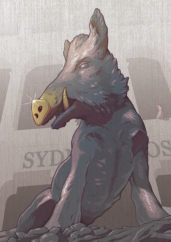
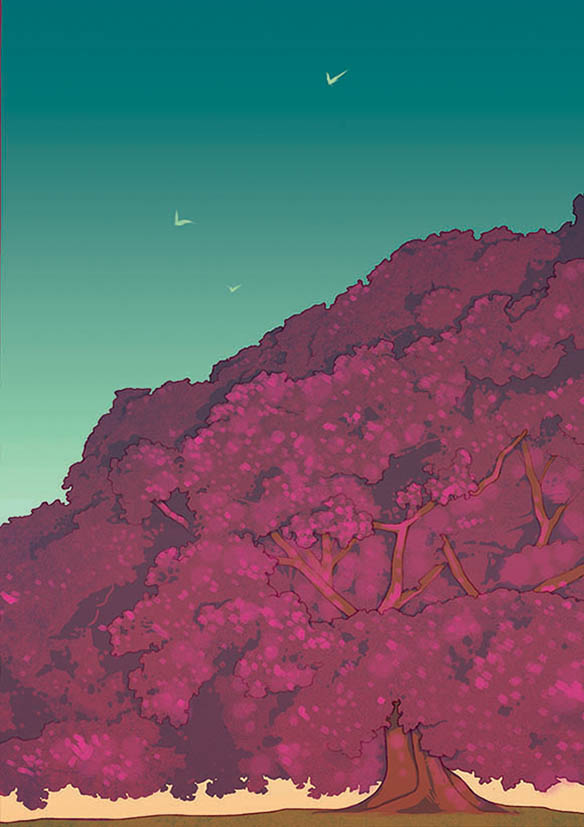
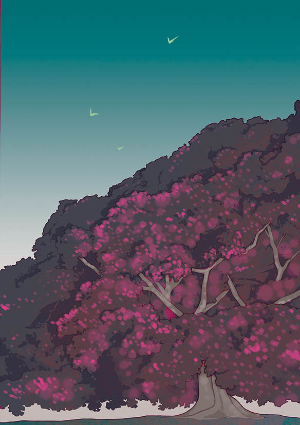
As mentioned before, I went in too bright and “psychedelic” with the colouring to begin with, and was asked to strip it back. The addition of the cockatoo(a bird!) was an idea I thought to incorporate in the rest of the illustrations as a little way of tying them all together.
Looking back on the set of illustrations as a whole, I think this one probably looks odd in comparison to the layout of the others. The client said they were happy with it though, and with the deadline looming, I thought it wouldn’t be wise to argue to do a redesign.
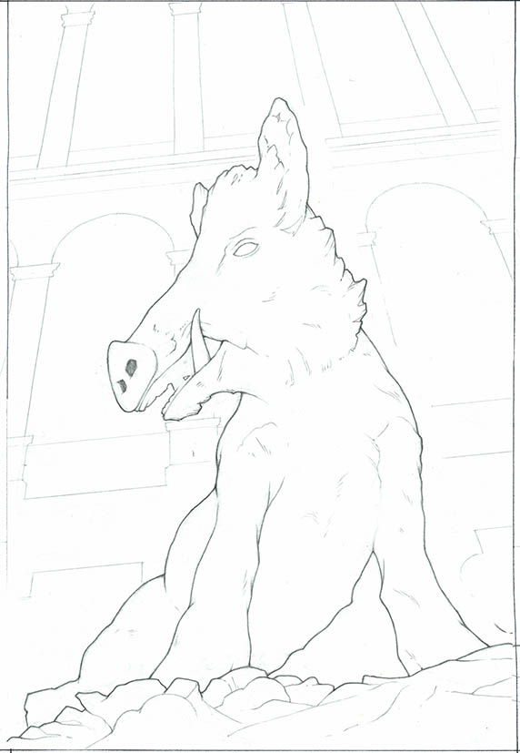
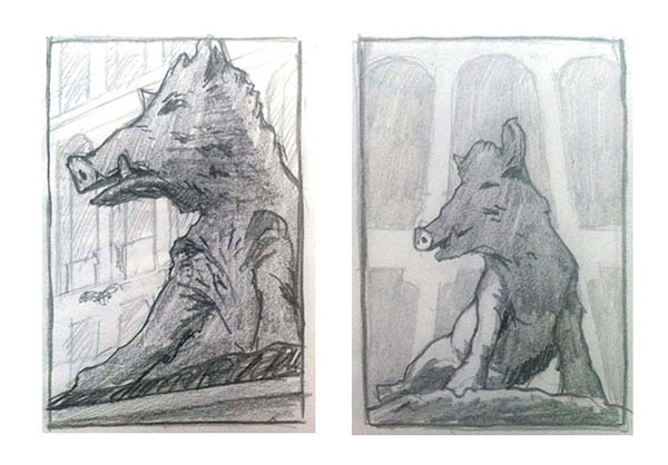
It was challenging to get a different angle other than straight on, as the main focus point of the statue is the golden snout. This gold stands out a lot more when you take the colour away from the background.
After some deliberation, the client asked me to redesign this one. They said the initial angle I went for, while interesting, made it difficult for viewers to recognise the artwork.
I sketched up the second version incorporating the surrounding environment to enable the viewer to recognise it a bit more (as if the design of the sculpture isn’t distinctive enough!)
With this one I initiated the redesign myself. I thought the original upward angle was cool, but as with the Dobell sculpture above, I thought the artwork had to be shown more in context with it’s surroundings.
The more front -on angle allowed me to include a lot more shadow and lighting aspects to the illustration, which I feel is a specific characteristic of my style of work.
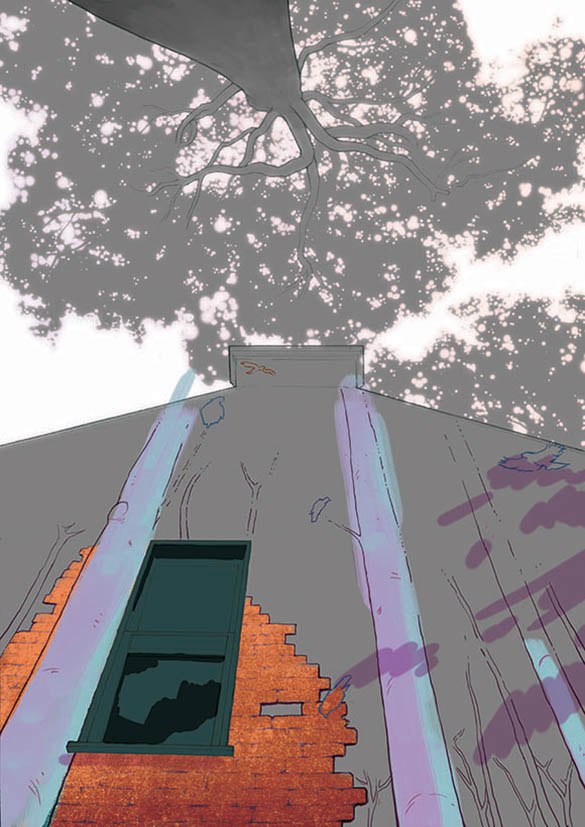
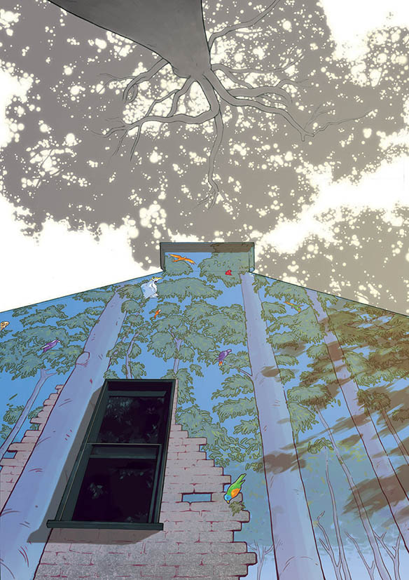
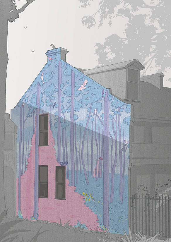
This one was a bit of a struggle. The artwork was a large fig tree which is under-lit with coloured light that aims to contrast whatever colour the sky is at any given time.
My proposal of having a colourless background and colourful artwork, was challenged by this installation, as both the background and the tree essentially are the artwork and need to be in colour. After discussing it, the client decided that it was too difficult to make this work, and that it would sit well alongside the other illustrations.
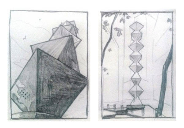
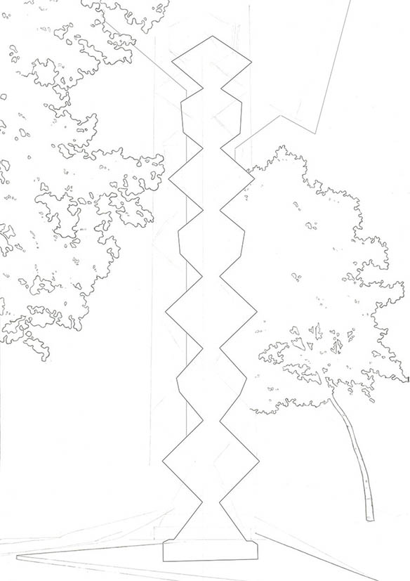
This was the sculpture that I used in my proposal, but as the client specified that they wanted all the illustrations in a portrait format, my first design didn’t work as well and was rejected.
I was a bit disappointed, as I really love the idea of showing the sculpture from the top-down angle, showing that unique shadow on the ground below.
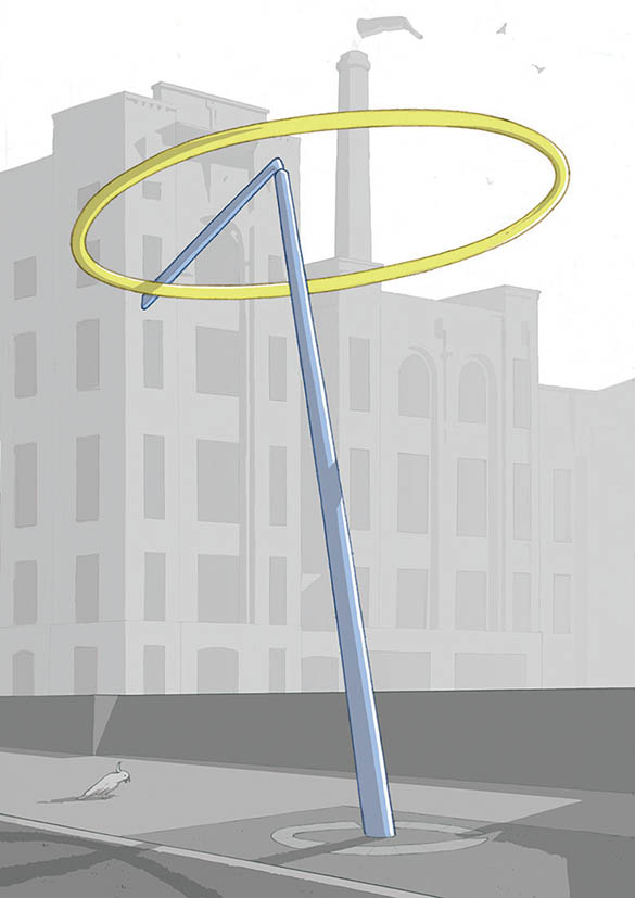
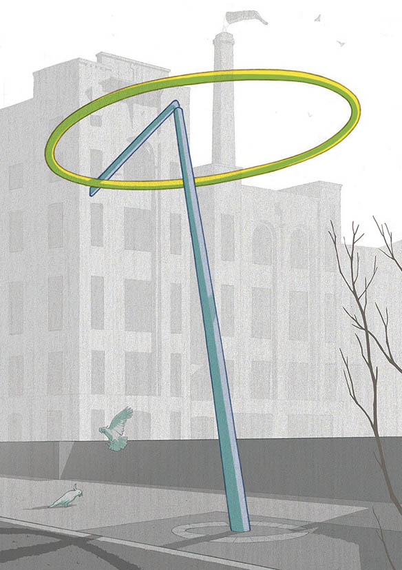
The client was quite particular about showing the old tobacco factory in the backdrop, so I had to include that. It was quite tricky trying to show a bit of detail in the building, but not take too much away from the sculpture itself.
—
Well there you have it! Every job is a new learning experience both in the technical, creative process, and also in working with clients in a sympathetic way, in order to complete the project to mutual satisfaction.
YOU! Let me know below if you have any questions about absolutely anything, or if you liked a particular image.
Lots of love, Ainsbar.
16 Comments
G-man
22nd April, 2016Good work, man! Inspiring even for a non-illustrator like me 🙂
Ains
22nd April, 2016Thanks G-man! Glad it transcends!
Chris
21st April, 2016Great job buddy. Really pleased how this turned out for you!
Ains
21st April, 2016Thanks Chaos! Appreciate it!
Delphine
21st April, 2016Great work Ains! You have such a strong recognisable style. Keep up the good work! Looks like Oz is providing a big source of inspiration.
Ains
21st April, 2016Thanks Delph!
Trying to make sun while the hay shines.
Sean
21st April, 2016Great work dude! thanks for sharing!
Ains
21st April, 2016Awesome! Thanks Sean, glad you like! 🙂
Keziah
21st April, 2016I really appreciate you showing your process here! They all look really amazing! Might I just ask- how do you normally paint the trees? Drawing out individual leaves or do you use a specific brush?
Ains
21st April, 2016Hi Keziah! Thanks for the kind words!
Which trees were you referring to specifically?
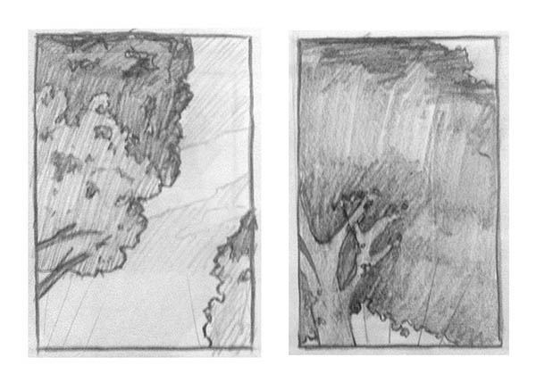
The trees in the “Dobell” sculpture where outlined in pencil and coloured with grey.
I use Photoshop for the colouring process:
The ones in the upward angled “What Bird Is That?” mural were mostly done by using a soft round eraser brush in Photoshop (erasing the grey). Then I selected all the white area(the sky), made a new layer, which I filled with white and put above the tree layer, then added a soft blur effect, which gave it that sunlight-coming-through-the-leaves effect.
The leaves in the “Earth v Sky” image and background of “Archibald Fountain” image, YES, I used specific paint brushes that I experimented with from Kyle’s Ultimate Megapack.
I discovered from doing these illustrations though, that I don’t really like using the specific effects of brushes for this kind of thing. I prefer doing itmore by hand like the leaves in “What Bird is That?”
Does that make sense?
Keziah
23rd April, 2016Yup, lots of sense! Thankyou so much!
Ains
24th April, 2016No problemo, glad to help! 🙂
Bill Murphy
21st April, 2016Hi Great article.
Thanks for posting your process.
You mention in the beginning, your agent. Did you ever talk in your blog about using and working with agents? If not could be a good article for the future. I know I would get a lot out of that.
Did you have a fee for the proposal. Still making something, event if you did not get the job? You did put in some time. Possible you did this in hopes of getting the gig. Similar to updating your resume for a position you want. Just wondering how you work with that part of the process.
As always, great job. Thanks again for sharing.
Ains
21st April, 2016Hey Bill, thanks for the response!
I haven’t talked specifically about be part of an agency. But that’s because I honestly don’t think I have enough material or experience with working with one to write an article – it’s probably been a year, this month, that I’ve been with The Drawing Arm.
I by no means rely on them for work but through the handful of jobs I’ve had from them I’ve developed a certain trust of them and feel that we our on the same side working towards a mutually benefit.
Did you have a fee for the proposal.
Good question. In fact my agent did state in the initial email that they usual charge the client a certain fee for concept work, but as they were a government body they weren’t able to process that type of payment BUT the client seemed happy to get a proposal from me in just writen form (which is exactly what I wrote in the “HOW ABOUT THIS SECTION”) But I decided it would take me little over an hour to sketch up an example regardless, so I decided to do it.
This is an example of where I developed a sense that my agency “have my back”, as I feel that, behind the scenes, they put it to the client that their artist wouldn’t do a concept without getting paid, and then the client may have responded with something along the lines of “Well, could he at least do a written explanation of his concept by answering these questions?”.
Hope that helps.
Laura
21st April, 2016As always, I love your work and really appreciate the time you put into sharing your process!
Ains
21st April, 2016Thank you Laura! I appreciate you saying so.
I’m still trying to get faster at writing and uploading all the images!