JOIN THE
NEWSLETTER
GET NEW POSTS SENT STRAIGHT TO YOUR INBOX
YOU JUST RELAX AND SIT THERE!
+
GET A BUTT LOAD OF TEXTURES I USE IN
MY OWN WORK FOR FREE WHEN YOU SUBSCRIBE.
It's free. No spam. Unsubscribe anytime you like.
You will also instantly receive a free collection of textures that I use in my work!
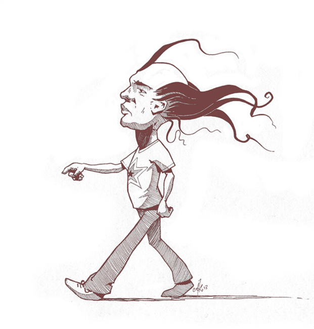
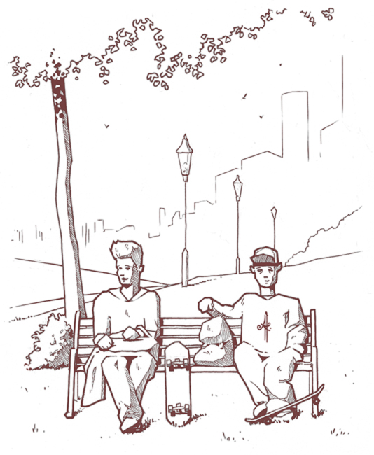
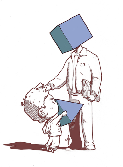
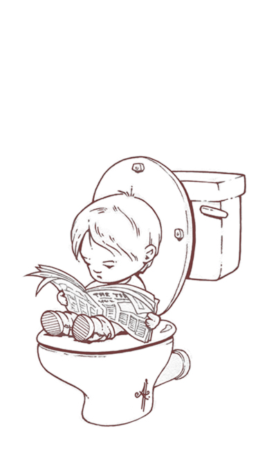
Hello. Comeback post!
Here are some more Conversatials for your delightment. If you don’t know what Conversatial is, it is a website by Stefan Knott (no relation – nah, he’s my brother) dedicated to overheard snippets of conversation. I take on the fun task of interpreting them in visual form.
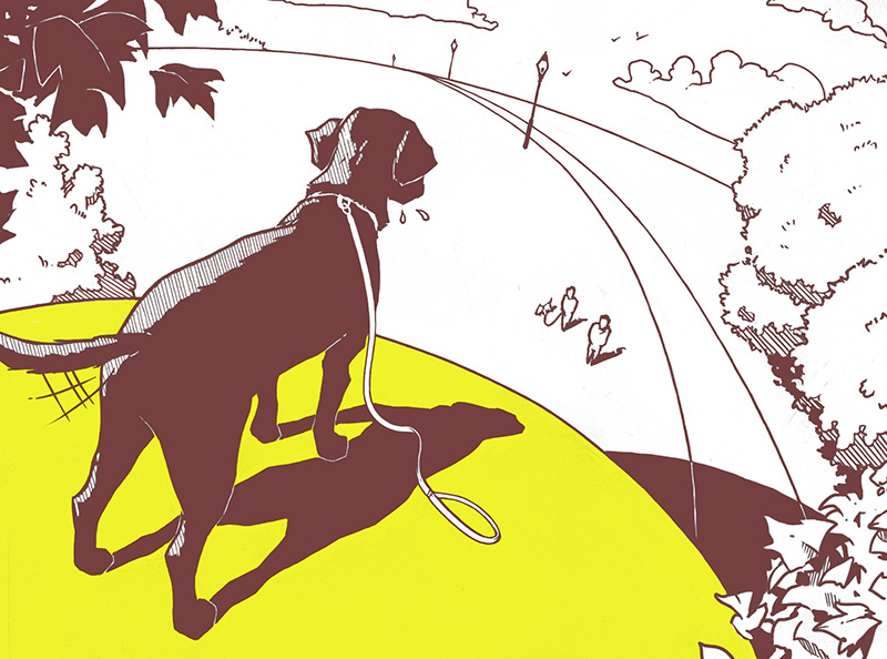
“You just can’t resist a big yellow ball”
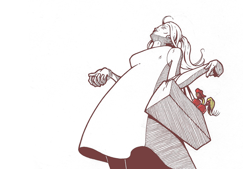
“I’ll go out with you if you buy me a Barbie”
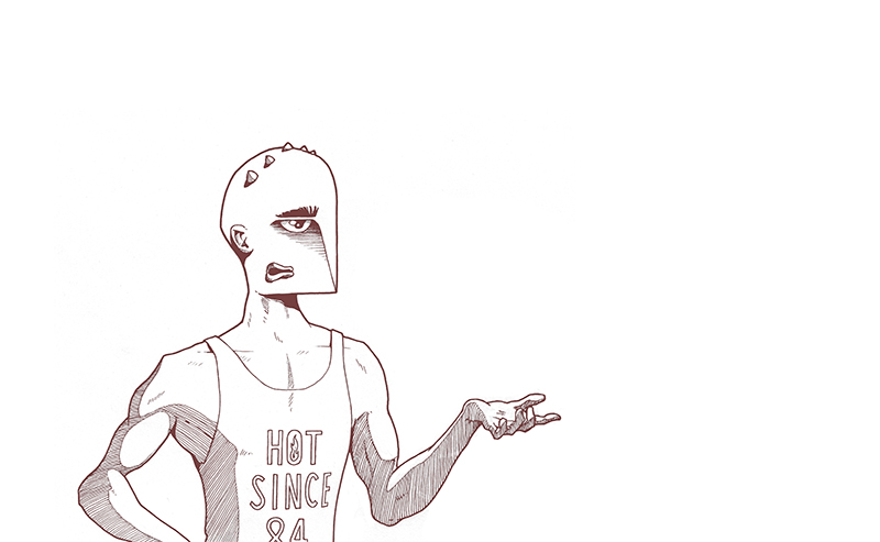
“Nobody likes my face”
Here are some new snippets of conversation that my brother caught for his website Conversatial. Once again I have added my own surreal, visual interpretation to them.
Enjoy!
“Your hair looks in good condish”
“Thanks … it’s always in good condish!”
“Yeah, but it looks, like, shiny.”
“Yeah.”
“Do you like death?”
“Er …”
“The world is going to end tomorrow. I look forward to it.”
“Why’s that?”
“I think it will be relaxing”
Son: “Shall we shape daddy’s head off?”
Dad: “No. Daddy likes his head where it is.”
Son: “No!”
Dad: “I see what you’re getting at, but …”
“It’s funny how children … shit!”
“… going on about your boobs in the hallway.”
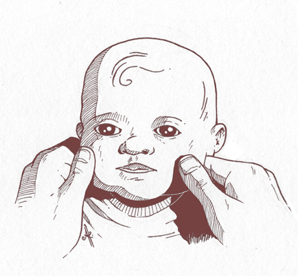
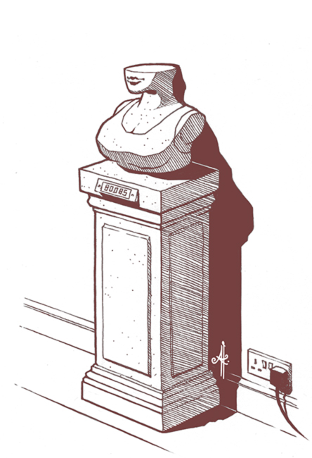
“You always hurt my face!”
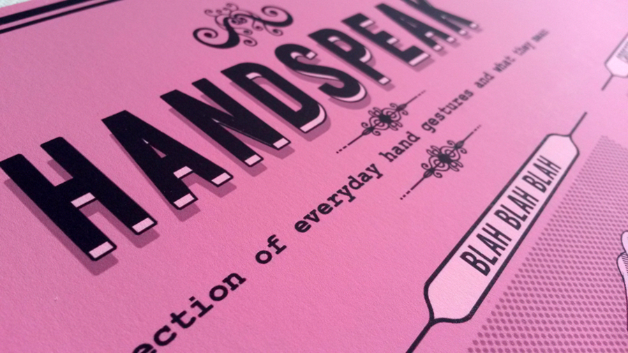
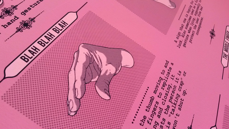
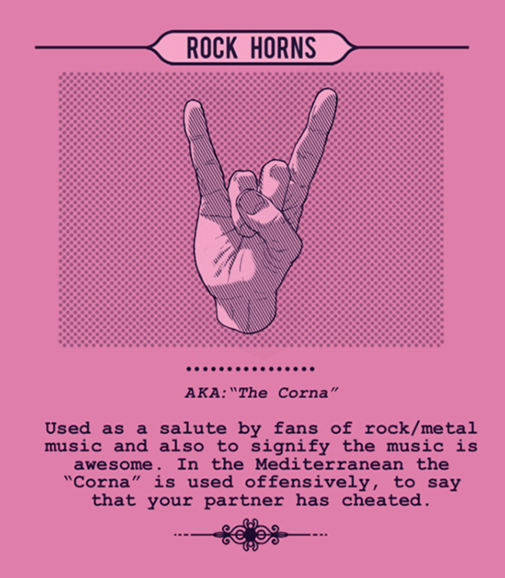
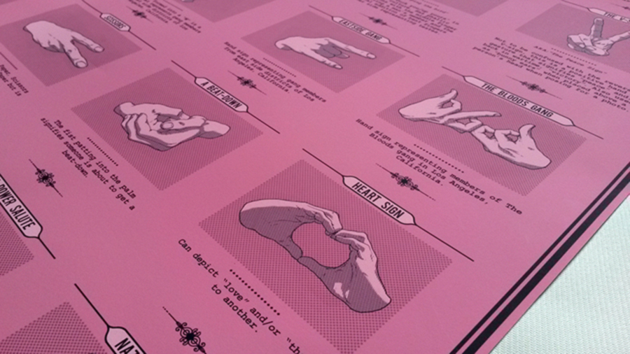
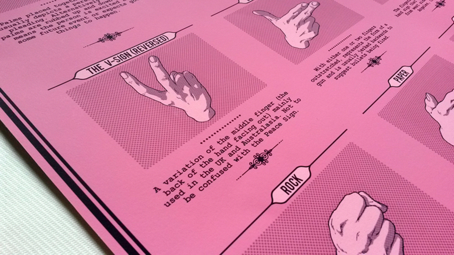
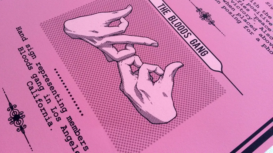
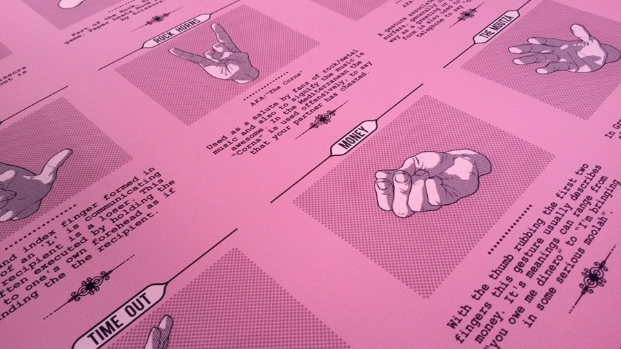
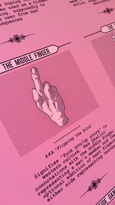
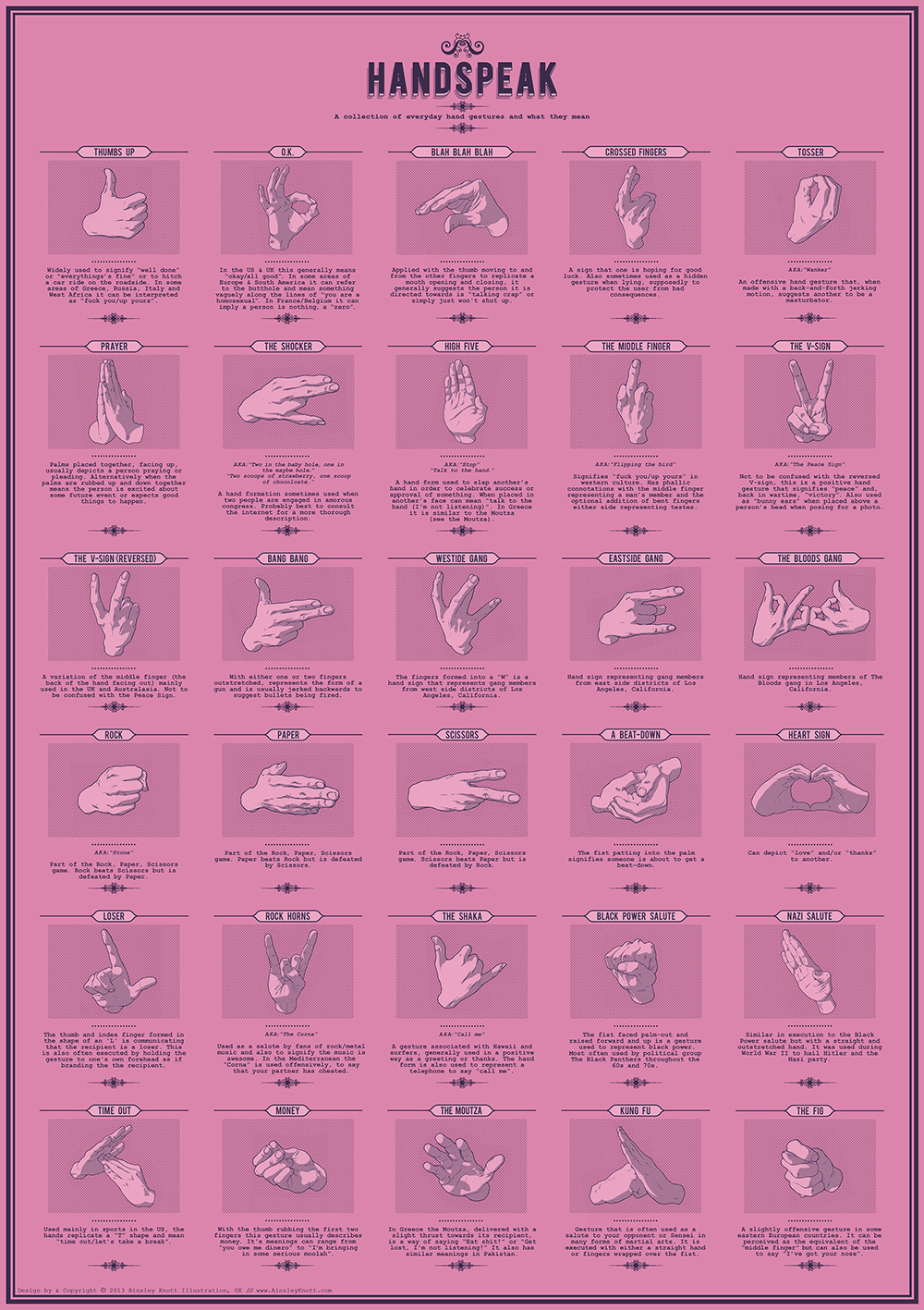
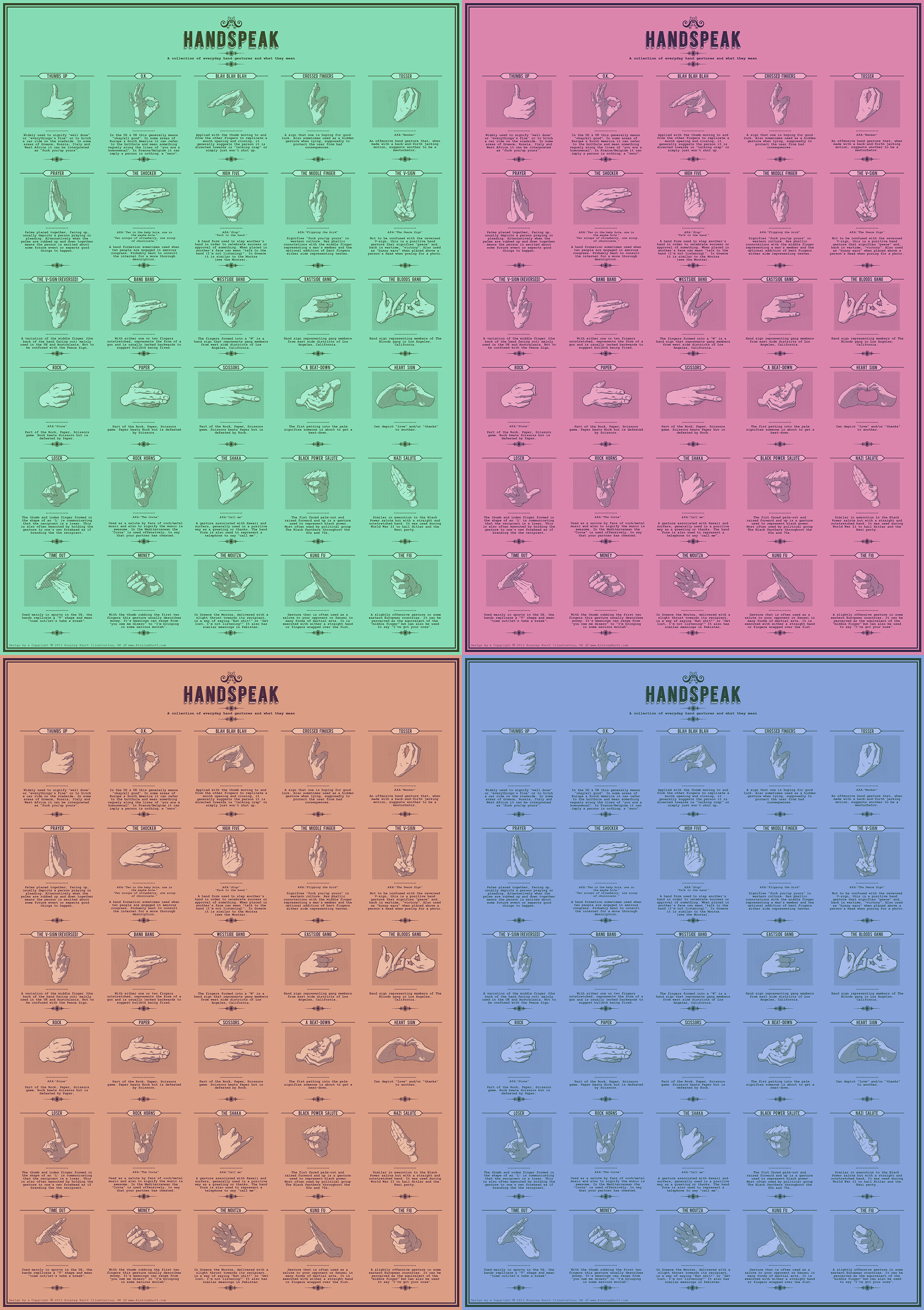
For the last few months I’ve been working on a design for a hand poster idea I’ve had. After lots of tinkering and procrastinating I feel it’s finally ready to unleash to the world.
We often communicate or condense an entire message into simple hand gestures, something which can often bypass language barriers.
The poster consists of 30 different hand gestures, many of which we use in everyday life and others which might be new to you. Each one has brief description explaining it use and possible meanings in other cultures.
It’s available to buy on the Red Bubble website here
Also: *Parental Advisory Warning – some naughty words included*
Here’s a design I entered for another Talenthouse competition. It was to design a film poster for Jon S. Baird’s Filth movie based on the novel by Irvine Welsh.
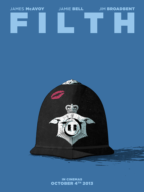
If you like it and get a quick sec I’d really appreciate your vote!
Here’s the link. “Filth” Poster Design by Ainsley Knott
Hullo.
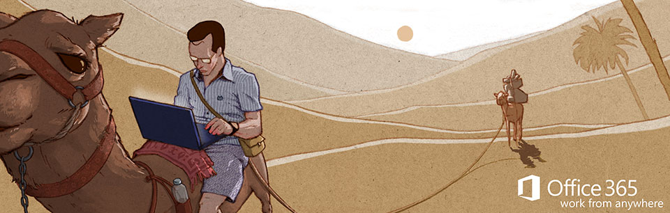
I’m currently participating in a couple of Talenthouse competitions at the mo. One for Microsoft’s Office 365 and another for Sony Playstation’s online network.
Both were quite open brief but and the ideas of both appealed to me.
The brief for Office 365 was to design a piece of artwork inspired from the tag-line ‘Work from anywhere’. They’re aiming to promote their new Office porduct as one that can be used pretty much anywhere and on the go. Thus they were looking for interesting locations you’d be using the product.
I had a few ideas I wanted to go with originally but ultimately settled on the ‘Work from camel’ here:
Playstation were looking for a piece of artwork to celebrate and promote their online gaming community and the idea of playing games with friends and others around the world. They brief was entitled ‘Way of play’ and a list of many other tag-lines relating to online gaming were provided as inspiration.
I went with the tag-line “Couples who slay together, stay together” and came up with this image of two players’ characters alongside each other connected with chain ammo from their guns and forming a heart between them.
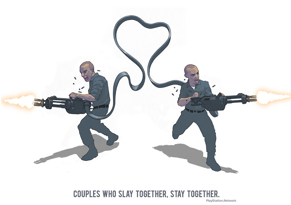
The competitions are vote based so if you get a quick sec I’d really appreciate your vote.
Talenthouse Microsoft Office 365
Thanks guys!
Back once again! I’ve entered a design competition hosted by Talenthouse to create some artwork for the release of a new film Stoker. The idea was simply to come up with a postcard design that will be used in promotion.
To give you a brief description of the design I decided to keep it very simplistic with a straight black and white colour scheme as I felt it was more striking.
The design draws upon a few elements and themes which I observed when researching the film.
Firstly the brogue shoes that the protagonist wears are used as the main image here. There is a scene in the film where these shoes are swapped for a more mature and elegant woman’s heeled shoe. I believe this represents the characters transition from adolescence to adulthood. The unravelled lace represents this but also represents how the world of the protagonist and her mother becomes more and more undone following the death of her father.
There is also a murderous theme that runs through the film which I simply represented with a flick of blood on the shoe. This also acts as a design element for composition balance and to help suggest the form of the shoe.
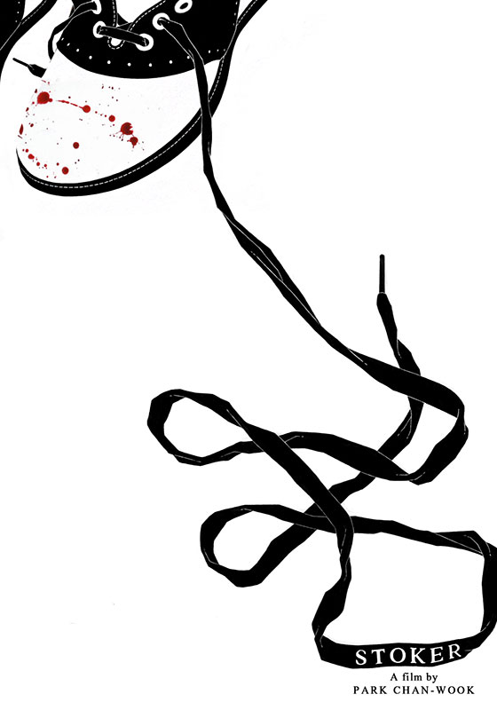
Anywho as it’s a vote-based competition I would appreciate any support. If you don’t mind taking a couple o’ secs, voting is open from Feb 4th 6pm – Feb 11th 6pm (GMT). Here’s a link to the page: Talenthouse – Ainsley’s Stoker design
Muchas gracias!
Here’s a recent illustration I did for the 4th issue of Boat Magazine which centres on Athens. The AD asked for a couple of postcard images that represent a more idyllic, nostalgic view of Athens to compliment a short story for the back of the mag.
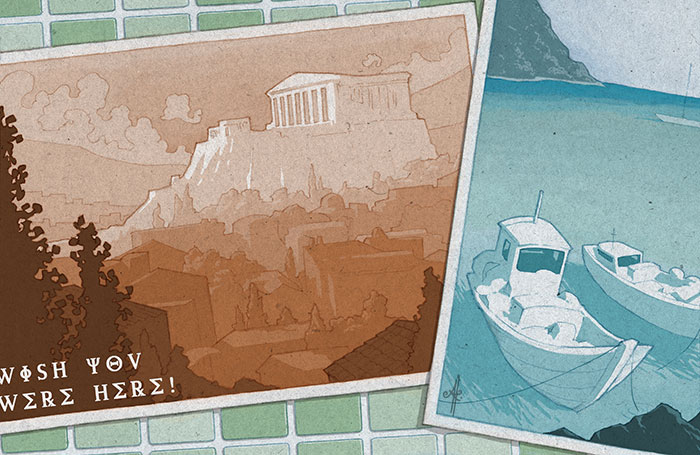
Overall, it was a pretty smooth project to work on. I seemed to capture what they were looking for in my initial roughs and then the final mock-up was approved pretty much straight off.
I thought I should bring to your attention a little website my brother has had up and running for a short while called Conversatial. It’s a very quaint and amusing blog-style site that documents little snippets of conversation he overhears day to day.
What makes them so enjoyable and compelling is that they’re very short and sweet and completely without context. This allows visitors to use their imagination and visualise what must have been discussed or gone on at the time.
I was really inspired by some of the snippets that I thought it would be fun to get involved by illustrating my own visual interpretations of them. Each entry on the site has an accompanying illustration that can be seen by clicking the link under each Conversatial. It seemed better to keep the illustrations separate from the entry at first glance so to not detract from visitors’ own imaginings.
I have included some of the accompanying illustrations below but please go and enjoy their literary counterparts here: CONVERSATIAL


Hello!
I recently produced some illustrations for an up and coming book release by author Sally Harris. Entitled ‘Diary of a Penguin-napper’, the book is a wonderful, funny and light-hearted story about 11 year old Marty and the lengths he goes to obtain the girl of his dreams.
I was asked by Sally to produce illustrations for it in the form of torn out entries from the boy’s diary, which included a few scruffy doodles. It mainly involved working in a style that looked like an 11 year old boy had produced, I also had to employ texture and layering techniques to make it seem as if it has been torn out and stuck into the pages of the book. The project was a very enjoyable one to work on and is a great story to boot, and that made the working process all the more easy.
As part of the imminent release of the book I was asked by Sally to do some Q & A about my working practice as an illustrator and what inspired me to get into illustration in the first place.
Please take a sec to read the interview on her site here Frankly Books, and also find out more about ‘Diary of a Penguin Napper’.