JOIN THE
NEWSLETTER
GET NEW POSTS SENT STRAIGHT TO YOUR INBOX
YOU JUST RELAX AND SIT THERE!
+
GET A BUTT LOAD OF TEXTURES I USE IN
MY OWN WORK FOR FREE WHEN YOU SUBSCRIBE.
It's free. No spam. Unsubscribe anytime you like.
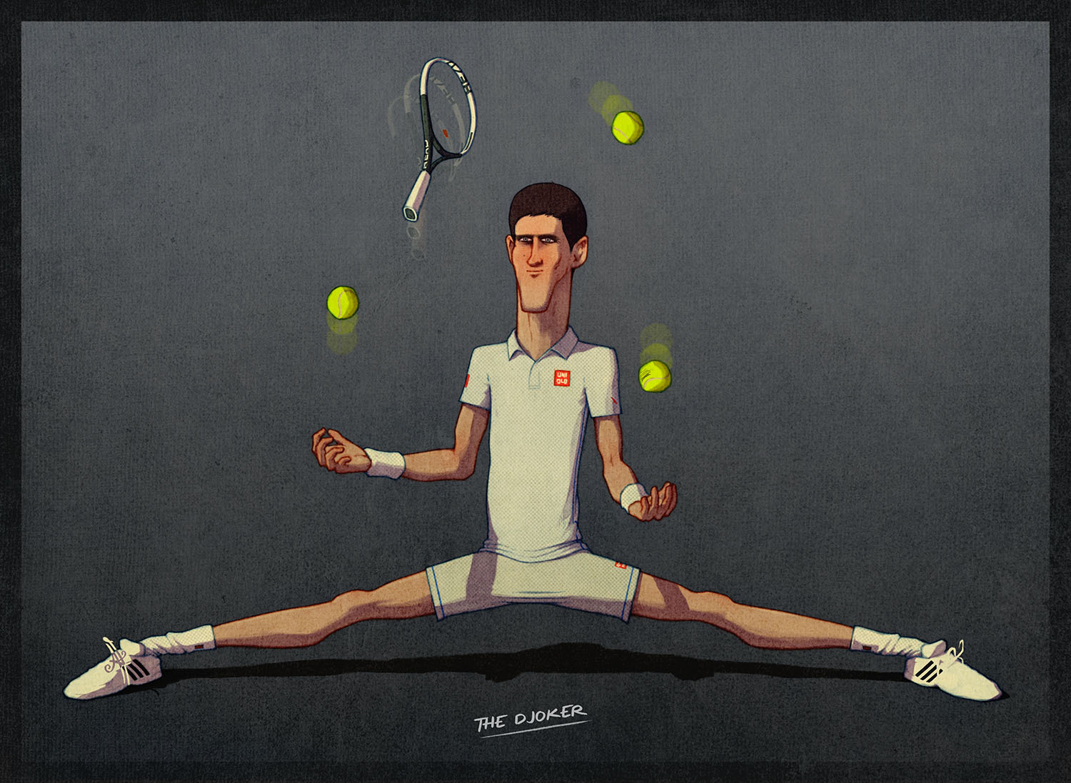
Hey there sports fans! And/or art fans. I’ve been locked away the past few weeks working on a few things, mainly a new series of illustrations of the tennis Big Four. For those that don’t know The Big Four are top tennis players Roger Federer, Rafael Nadal, Novak Djokovic and Andy Murray.
—
Some of you may have seen versions of Djokovic and Nadal which is where the idea for this series began. As I posted them around on different sites a lot of people were requesting that I do the other two and create a series of the four.

The popularity inspired the idea to do my first art launch of limited edition prints. With that in mind I decided each illustration will need to be worthy of print.
As it has been a long while since I originally created the illustration of Nadal I thought he needed freshening up. I noticed a lot of flaws in the original design and I thought it would be helpful to share a bit of the process I go through when analysing and improving my artwork.
There are some pieces of advice that are instant eye-openers and just stick with you. I got one such piece of advice from a Chris Oatley article and it really helped improve my illustration work. Now I always use it as a fundamental check whenever creating new work.
I can’t remember the exact quote but it goes a little something like: “If the initial drawing doesn’t look right, or doesn’t work, then the finished product will fall short”.
Before reading this advice I’d spend hours on Photoshop changing colours, shadows, adding textures, trying to get an image to look half decent in my eyes.

But I couldn’t work out why it didn’t work and would go slightly insane and then would avoid sitting down and working. (Sidenote: For me, procrastination almost always occurs through lack of certainty when it comes to my artwork- not knowing what I’m doing or being too indecisive in my creative decision making.)
Then I’d strip it back to the linework and most of the time realise something in the drawing wasn’t up to scratch…
When you work on an image for hours the whole thing loses it’s essence and you will start failing to notice the flaws in your image. I’ve shown in-progress work to friends, that I feel happy about, only for them to point out flaws that I somehow completely missed. That’s because they’re seeing it with fresh eyes and can see the things you can’t any more.
Fortunately there’s a simple way to see the image fresh as if for the first time and pick up on all the flaws… Simply flip (mirror) the image.
When I decided to upgrade the image of Nadal I first thought to flip the image to see if I’d missed things. All of a sudden it was like looking at it for the first time and though I’m a recovering perfectionist there were certain things I couldn’t forgive myself for in the design.
When I flipped Nadal here, I noticed a few big things; his shoulder was popping way to far out, his lack of neck, and most of all that his leg and calf were at some weird, distorted angle.
I use the Photoshop function for this: [Image>>Image Rotation>>Flip Canvas Horizontally.] But if you’re working old school you can use a mirror or simply turn over your page and place it on a window or lightbox.
This one I use when I’m in the middle of colouring a piece and it doesn’t seem to be working.
I always start the colouring process by filling my line work with greys to work out where I want the lights and darks. After I’ve worked in colours I will flatten and grey-scale an image to see if all my lights and darks still look how I want them to. Admittedly it’s a huge safety net when working digitally and you wouldn’t have this luxury if you were colouring with traditional methods.
I get overwhelmed when I see a lot of things that need changing and that’s why I’ve started to write it all down.
I create lists of all the tasks and adjustments I need to make to an image and add more to the list as I notice things. This is especially effective when you decide to stop work for the day because when you come back to it the next day you know exactly where you are and what you need to get on with.
Before I make the lists I always ask “What one addition/adjustment would I need to make to the piece to be “okay” with publishing it?” For me personally, this can be a drawn out process because I feel there’s always something I could add or change to be satisfied with it.
I usually go on to further the list by asking myself “What could I add that might take this image to the next level?”
It’s the power of questions man! Once I started asking myself questions it really helped me become more objective and step up my artwork… (and ultimately avoid the straitjacket.) Even the simple question “What about this isn’t working?” is enough to clear the way and get focussed.
I hope you can take something from these sharings. Please feel free to spread the word and drop a comment to say things. Please, the more ridiculous the better…
4 Comments
Lizzy
30th September, 2015Thank you for the tips, Ains!
Viewing illustrations with fresh eyes have always been an issue for me since whenever I’d ask someone else to have a look, they’d point out things I’m obviously not done with yet. I.e. “it’ll look better in colour.”
Ains
1st October, 2015Thanks Lizzy! Yeah I know, it can be really annoying when people point out things that you already know to add.
Showing people your work and being open to criticism I think is very humbling and really helps you grow. I need to do it more.
Bill Murphy
28th September, 2015Nice article, thanks for sharing. The flipping is a definite helpful tip I use a lot. I also love the grey tip. In my graphic design and illustration projects converting to grey can help show the intensely in colours. Example is using complimentary colours like red and green may seem great but if the hues are to similar they look off. Change to grey and instantly I find I know what colour to brighten or darken.
I know writing is a different form of art, but I find it helps in my illustration. Character design especially. Name, age, sex, social life changing moments all help to write them down. This writing may never be seen by the final viewer but it helps you build the character before you begin the illustration. This can work in a landscape illustration or scenic piece by writing descriptive words and asking the weather or time of year, location and time of day.
Thanks and hope my additions are helpful
Ains
29th September, 2015Hey Bill, thanks for the response. I really like your tip on naming traits of a character or scene you’re building!
I never considered it before but I can see how that would really help get inside the subject matter and truly get those traits across to the viewer. I’m going to try that out in future.
Thanks you for the tip and thanks for reading!